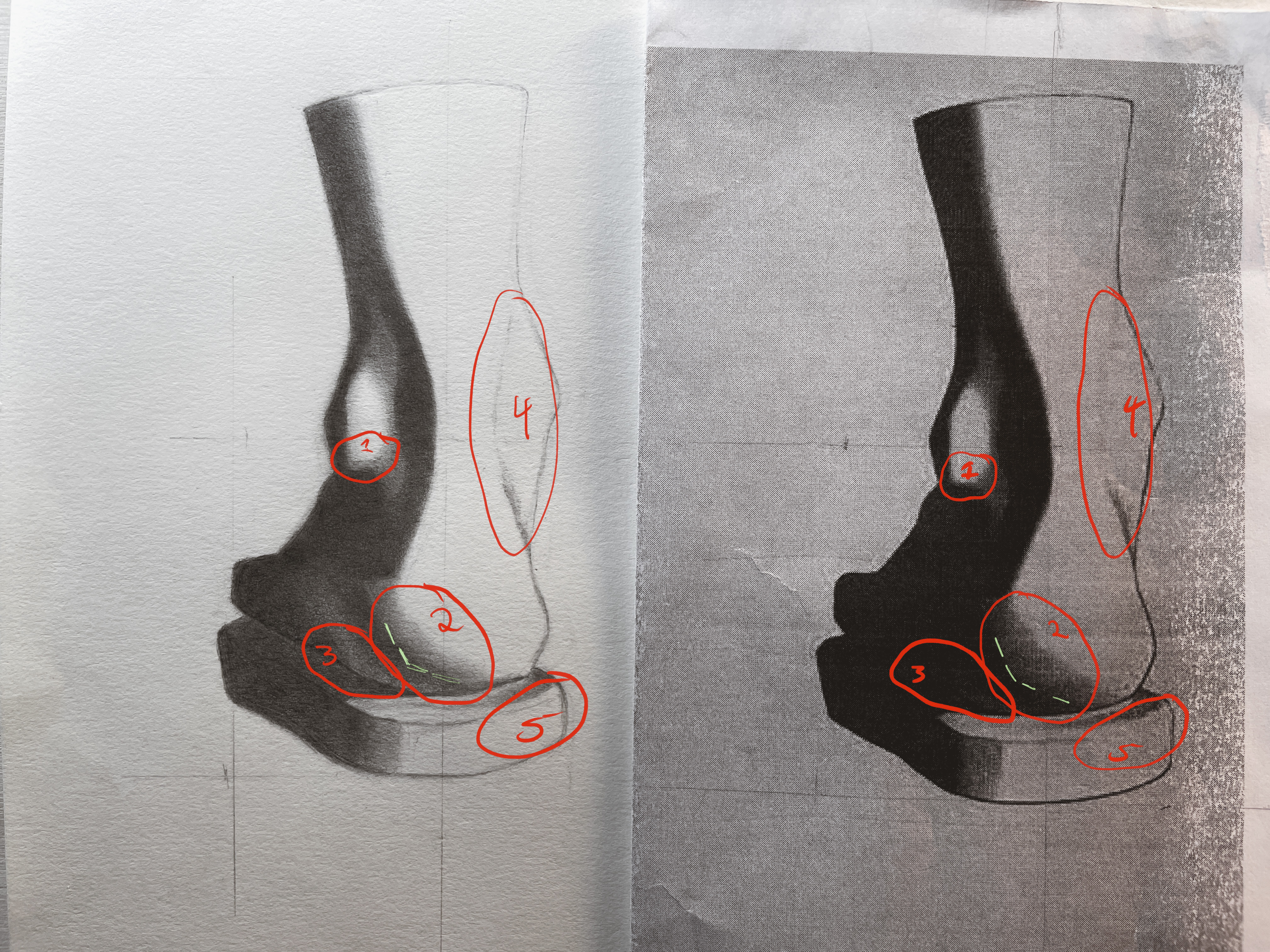
my instructor's critique:
Circle 1 - This is a small adjustment, but I think your shape here tips down to the left a little too far, and could be straightened out just a bit
Circle 2 - Right here I think your angle is a bit too simplified into one angle and I think could do with a bit of an angle break to become slightly more rounded like the heel of the bargue plate (see green lines for adjustment).
Circle 3 - I think the reflected light on the heel here is getting just a little too bright. I think it could come down a value step to group with the shadows more.
Circle 4 - You might not have gotten here just yet, but I think this moment could be a little softer, I think this could be achieved with a 2H or even something harder like a 4H, and you could just feather out a little bit around the values you already have to make the edges look almost a little blurry, so that it feels less graphic. I think it would be a good exercise to do this with a pencil instead of a brush, because you will get practice creating micro-transitions. These almost don’t feel like you’re putting down graphite, but when you step away and come back you’ll be able to see the difference.
Circle 5 - This one is mostly a suggestion, I think you could lose the block in line here where is it lost in the bargue plate, because I think it will feel a little more refined and finished.